Why is it so important to not only make sure that we have good content, but also good design? We live in an age where content is said to be king, but there is so much of it out there. What is it that is going to differentiate your work from the thousands of other people trying to get the same message out? Good design. It’s really that simple. We are visual people. It is estimated that 93 percent of our communication is nonverbal. It only takes seven seconds to make a first impression. No matter how great your content is, if it doesn’t look good, people will probably assume that it is not very good to begin with. So what can you do to make a good impression? Here are four items to consider.
Negative Space
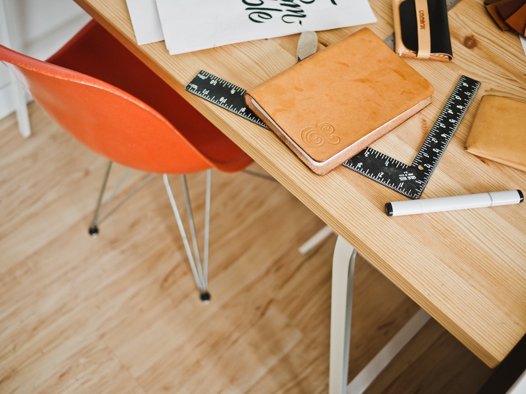
Negative space, or white space, is the area in your design which is blank. Now you may be thinking, “I have too much to share to waste any space in my design.” Do not think that way! If there is a lack of negative space, the design will feel cluttered and even overwhelming to someone looking at or reading it. Imagine that you are sitting down at a really messy desk. Is it easy to concentrate and get your work done? Probably not. If you think about it, a clean desk usually refers to the fact that there are empty spaces on it. No clutter means that you can concentrate more easily. It also means that your design will feel cleaner and easier to read.
Color
Color has a powerful affect on us. It can influence our mood or determine where our attention goes. So be careful how you use it in design. Do you want it to feel warm or cool? Do you want it to have lots of energy or to be relaxing? Color can help you achieve this. There must also be an awareness of how colors compete with each other. If you are not sure about this, look up color theory to understand how they can influence each other. It is also important to make sure that color does not stick out so much it gets in the way of your message.
Typeface
The typeface you choose directly impacts how easily your message can be communicated. Choose a font which is easily readable. Make sure that it is large enough to be seen at the distance your message will be communicated from. And remember that each typeface has a different personality. They can be sleek and angular, bold and clunky or cursive and flowery. They all have a time and place. Be sure to use the right font for your purpose. And please do NOT go overboard and use every font you can find. Keep it simple. Use two, maybe three fonts at the most in your design. It creates a better flow and keeps your design consistent. Also, if you are using a font for any type of commercial use, make sure that you have a licensed version of the font. And please do not use comic sans or papyrus. EVER!
Don’t over think it
You have too much to do to worry about every little detail in your design. If you are getting caught up in the details, just think to yourself, “Is anyone but me even going to notice what I am wasting my time on?” If the answer is no, which it usually is, then move on and do not worry about it. As James Victore is so fond of saying, “do you know what is better than perfect? Done. Done is better than perfect.” There are probably a lot of other activities you would rather spend your time doing. So get your work done and then go and do them. Who knows, you may just find your inspiration for your next design. Plus, it beats sitting in front of your computer monitor.
Oh, and one last item. Squint. After you have finished your design, squint and look at it. It will help you see the design as a whole. It may be fuzzy or blurry, but that will help you see if the color works or if it is too busy. Squinting is a great way to get beyond the details and see if the composition works as a whole.